Our Digital Director, Phil Shaw weighs in on the websites that made him (and incidentally, he made himself). He sifts through the boundary-bending risks he took, the way he pulled the content together and how he harmonized brand identity with cutting edge technology.
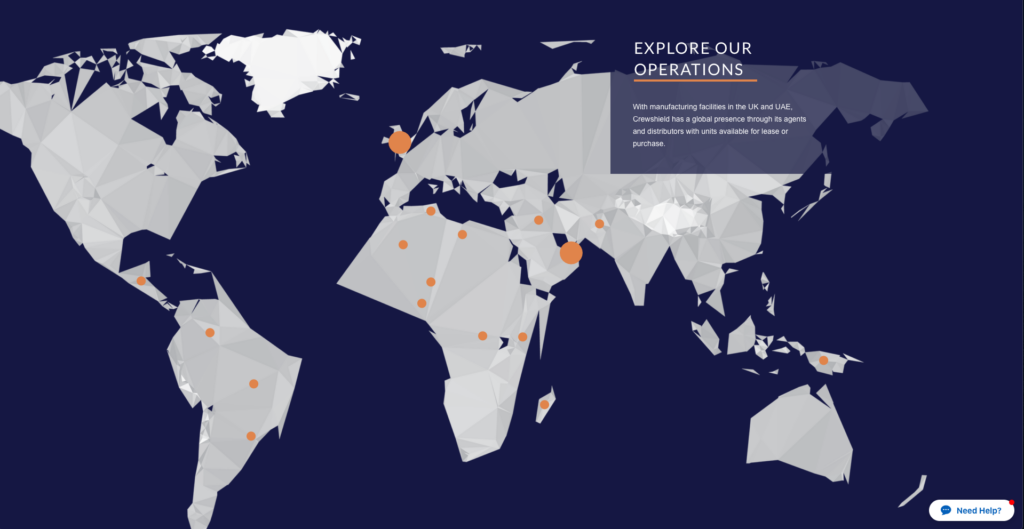
Crewshield
For me the overwhelming buzzword for Crewshield was innovation – cliche right?! Providing a navigable, intuitive eco-system for the Crewshield range of products to thrive ,was key.
Quite often in the defence world we see a swing of two things: either a repugnant mix of tepid blue and chewing-gum grey with reams of static images or an energy-drink fuelled rampage of blood red hues and pumped iron photos. None of this would work for Crewshield.
Fortunately for me, our team has extensive experience in the defence sector so we absolutely understand the psychology and habits of Crewshield’s target demographic. Like shooting ducks in a barrel, it was easy to replace the washed out greys with bright white, contrasted with a rich blue. It was important to retain a modest amount of conventionality, not wanting to swing into the high-octane head-rush of dark pages with searing oranges.
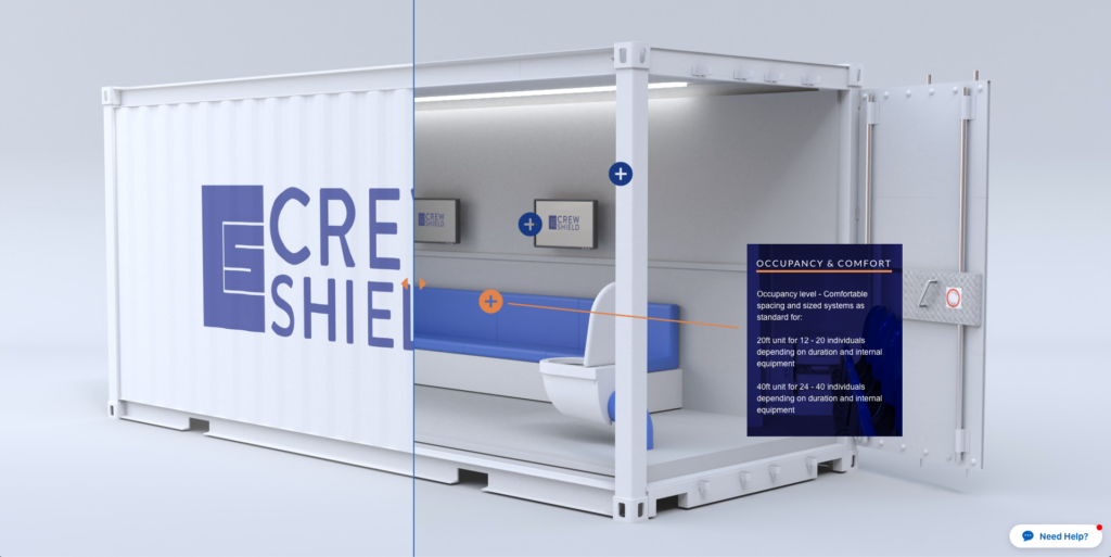
Keeping the products visual and core-messaging clean and succinct was an absolute must. Instead of the standardized gallery approach of the usual suspects we opted for interactivity! What better way to understand their offerings than being able to peel back the skin and take a look inside. And yes we also included a gallery for the staunch traditionalist!
The Crewshield website is full of ways for the user to interact or play with the content. From animated pull-outs to interactive slide-and-reveal effects. We couldn’t help but tinker with that gallery either, no finger-nail sized images here only a nice smooth light box!
Take a look at Crewshield here.
Evoke International
Where would I be if I didn’t lament the Evoke website! Our own re-design and aesthetic overhaul was always going to be a labor of love but the website was perhaps the most challenging of all.
We developed our new identity almost in tandem with the website, which sounds logical and straightforward in theory but in practice is maybe a choice a Padawan would make.
We quickly understood that our site was a literal expression of not only what we offer as a team but precisely who the brand is. Evoke is an entity that breaths its own air and has grown into a sum greater than its parts. It’s fairly common place to refer to a business as an organism but the way the website grew, organically, out the minds of all of us that bleed Evoke was startling.
We had to express the interconnectivity of our services with the face of our online home. So we knew that simple, linear, text areas and images just really wasn’t what Evoke was all about. We actively make new rules and shift paradigms with our strategies and outputs so our content needed to do this on our pages.
Our service pages are teeming with animation and interactivity. We truly understand how mind-boggling some of these topics are and how difficult any balanced decision is to make for you or you business. We are continuing to ravage coffee farms with the endless supply of caffeine it requires to deliver an experience you can take away and digest.
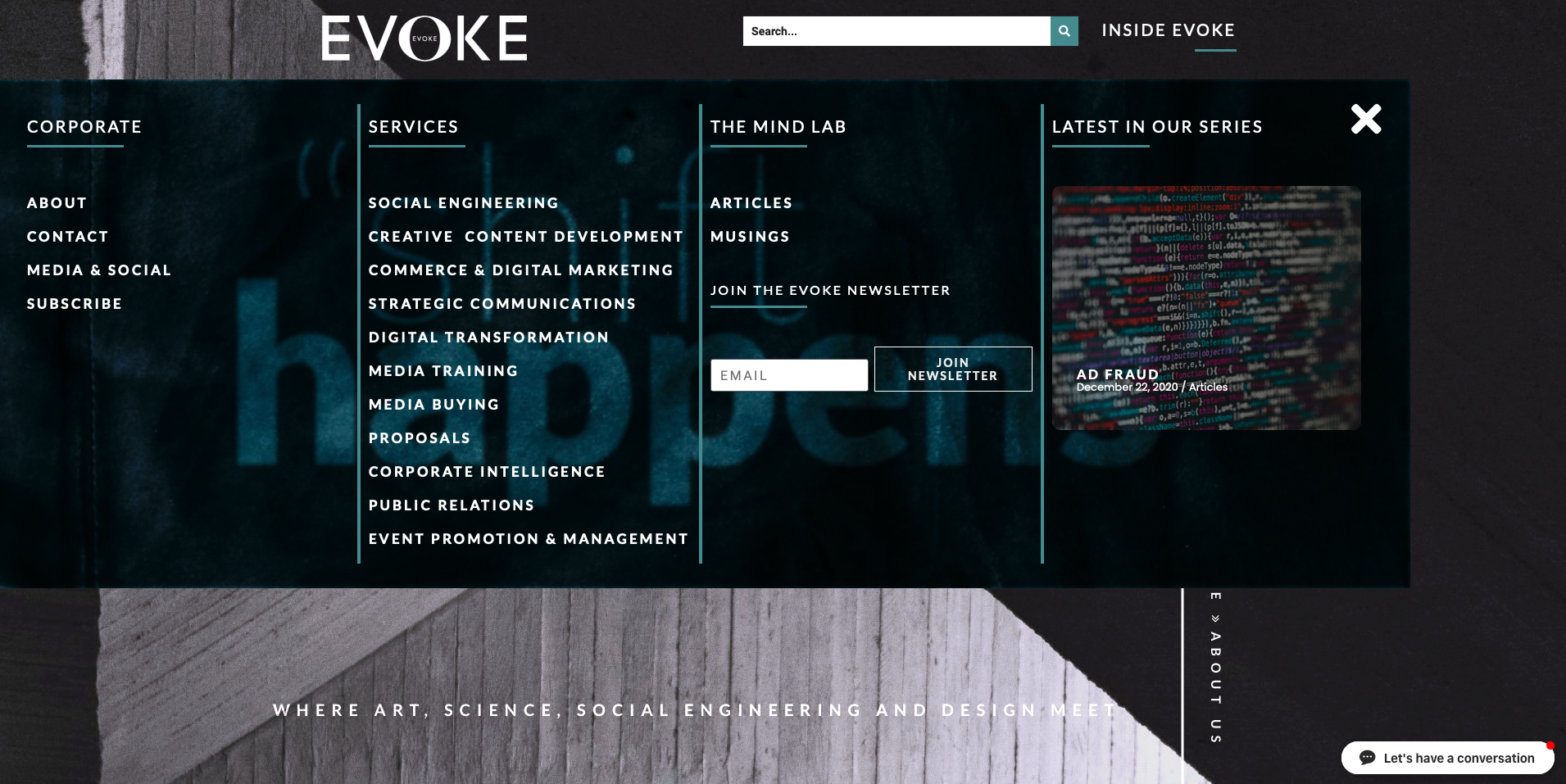
A core component of our entire site is boundary-bending. Whilst convention dictates we have navigation at the head of pages our menu is no ordinary experience either. Our team regularly publish articles and musings, such as this, so having a central hub of content was extremely important. Our Mind Lab isn’t just the home of our thoughts and writings, you can also find and listen to our Spotify playlist or dive into past newsletters.
The Evoke International is much more than a platform that introduces a brand – it’s a trove of information born out of true passion for subject.
Take a look anywhere around here, I guarantee you’ll find something else cool!
Strategic Intelligentia
This one is easily in the top three most visually appealing sites I have ever developed for Evoke.
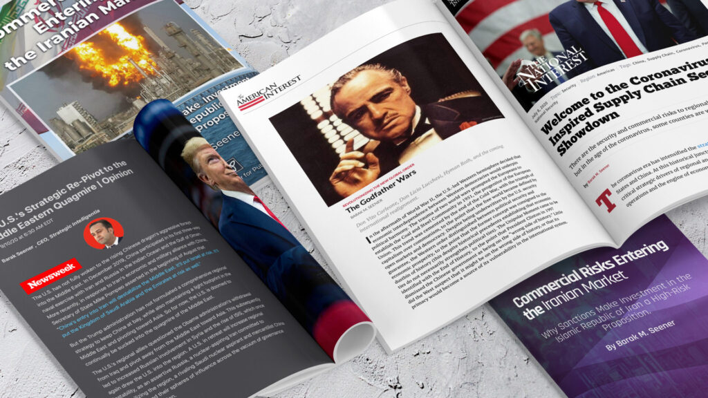
I worked closely with Barak Seener, our very own Strategy & Analysis Manager, to develop this unique aesthetic. Barak and I discovered very quickly that much like defence, there was an outdated convention of style in the geo-political web world.
The most important tenet of Strategic Intellegentia is connectivity. Not just connecting the user with the content but connecting them with the experience of that content. Strategic Intelligentia was designed to envelope the user and immerse them in a totally digestible world of topics that matter to them.
The core of Strategic Intelligentia’s output is article-centric with a healthy dash of media appearances so housing these was important to get right. You’ll find no magazine or newspaper blog here, only an engulfing wealth of stylish articles that’ll both educate and absorb you.
Strategic Intelligentia is also embarking on their Intelligentia Project which will allow users to directly interact with the Strategic Intellegentia team. This will include a huge amount of exclusive content, forums and seminars. The aim is to identify the geopolitical and geoeconomic risks facing the international order and our everyday lives.
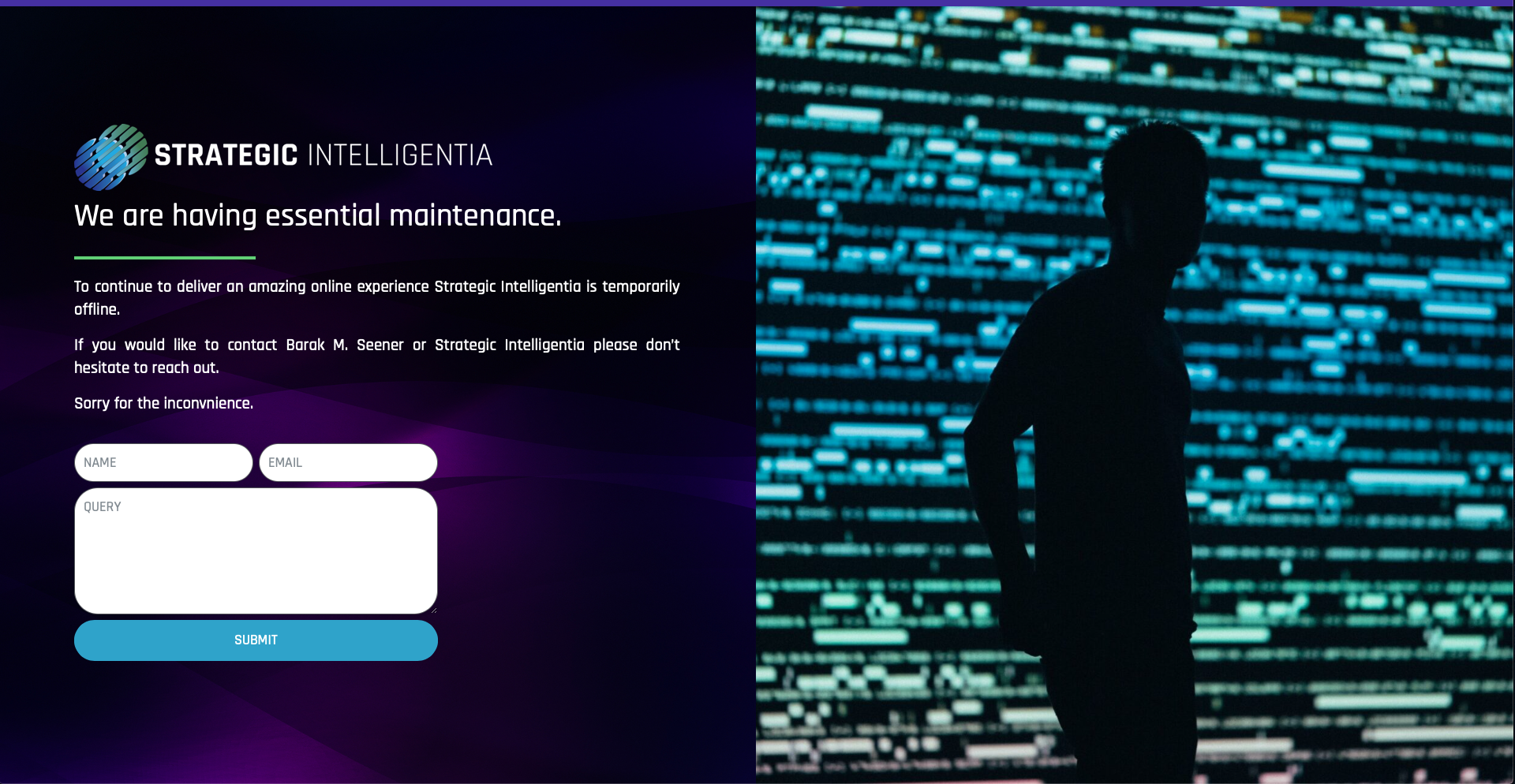
The Strategic Intelligentia website is still under development but at 99% complete we can tell you that you going to love it. In the meantime you can find them at
www.strategicintelligentia.com
No two web projects are ever the same, so reflecting on them and being able to compare them fairly is actually quite difficult.
Developing our own site was probably the most challenging. It was always a matter of head over gut! It was also the most exiting. Despite my almost Shakespearean love of photos of palm leaves and dusky sunsets, not many made the cut. I had to make my peace with that. Fortunately for me, it also decided we hate hipster photos of care-free kids looking thoughtfully out of windows, so it was a roundabout of lofty catharsis!
I have to say that the Strategic Intelligentia site was the most pleasant design experience. Using deep colors, rich purples and greens, allowed for some creative swatch play. It isn’t often that a brand actually adopts such a striking shift in aesthetic, but giving these guys life was organic and almost fluid.
Building websites can be like a busman’s holiday, but if I’m ever starved of creative cattle-prodding from our team, I would love to build the website for Terry Nation. Sci-Fi writer and creator of the Daleks, featured in The BBC’s Doctor Who, Nation died in 1997 and I don’t think his estate has ever had a website showcasing his work. If I could do that, I’d retire happy as Larry.


Evoke International.

