Creativity shouldn’t be stifled. In as much as we are educated on literacy, humanities and science, creative branding design is equally deserving of academic attention, too. The scope of creativity knows no bounds – anything should be possible in the digital age.
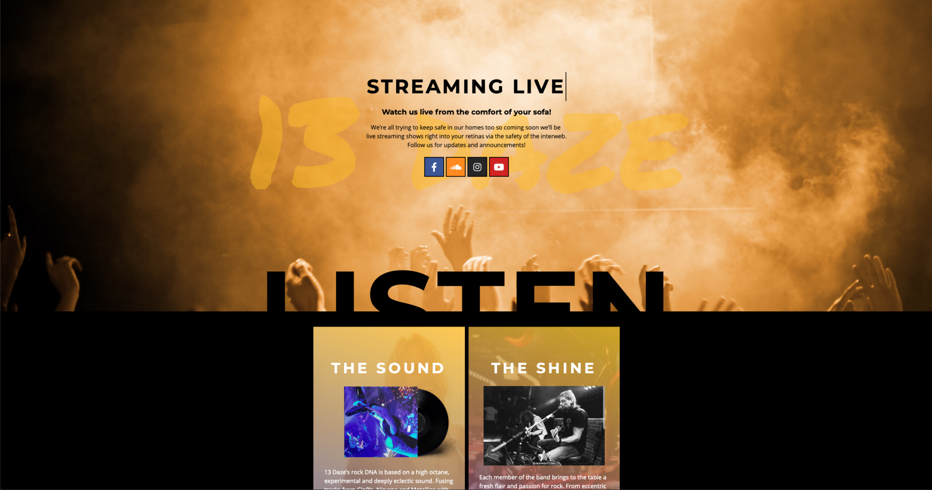
When tasked with developing a new online experience – amongst other ‘brandings’ – for a rock band, the initial thought of “oh yeah I can make this freaking gnarly” is the one that catches you. It’s only in the following, and almost totally consuming, mental sketch that the reality of what you actually need to do becomes clear, and it certainly isn’t always straight forward.
By very nature a band has character, so, I wanted this to be represented online. Now, the existentialist in me wanted to create a masterpiece of expression in the site itself but the realist in me wanted something less visceral and more semiotic. I conceptualized four fairly basic avatars of each of the guys that slide into the page as the user enters the social media area. Obvious, right? Well not quite.
As a team we collectively determined that the idea was a winner. The execution on the other hand, needed work! We already knew we wanted these very obvious characters and through several rounds of reiteration – including the addition of a backdrop of comic book-esque elements – we landed on the avatars we have now!
Design thinking – as reductive as this is, is about problem-solving. Creativity is a phenomenon whereby something new and somehow valuable is formed (thanks Wikipedia!) So what is my problem, then? Create something that IS the band, something that screams who they are and what they’re about – the holy grail of branding. It’s blasphemy to me to present something that is by definition creative in a way that is somehow mine and not theirs. The band are the guys and they have created themselves. They have learned, loved and laughed – this is who they are, it IS their character. Who am I to change that? So within a problem comes another problem which only creativity can solve…
It was important to have some kind of synergy between the site as a whole and their virtual envoys. In the footer they’re forgotten and in the header they take over – i.e. another problem! So thinking socially, where do the guys belong? Nailed to the social section, seductively sliding in when the user arrives. It might come across as basic but it is almost certainly where they should be.
Creativity to me isn’t ALWAYS about innovating it’s about what I have learnt. Although I could go into the anatomy of a homepage (I might do so sometimes), it’s much purer to distil and find what works. To me creativity and problem-solving are symbiotic and integral parts of almost all of us – even if we don’t realise it.

