So where do you even begin with the fountain of fonts out there? Our Digital Director, Phil Shaw gives us a few pointers.

Do you have a favorite font that you like using and ones that you stay away from?
There are more that I stay away from than I would use exclusively. I tend to steer away from heavy serifs, or typography with heavy curls because it’s a ball ache to make them work. With the typical other fonts that clients tend to gravitate towards, I would get them paired with really heavy sans serif font for balance.
What makes a good font in your opinion?
Something that you go back to – fonts like Bebas and Lato (their Google alternatives being Oswald, Avenir Next – maybe!) because they work so well in so many different ways across so many different media.
Where can you find fonts for typography that you like?
I tend to go to the Google font repository quite a lot. But if I am thinking conceptually, and I’ve bene given a brief and I don’t know where I’m headed with it, I would go to somewhere like Pinterest and I would have a look at type sets and font sets by putting in a key word that would match the project that I am working on. I don’t like to limit myself to stereotypical fonts – for example, if I was working on a fashion brand, I wouldn’t automatically look for a font that looks like a fashion font – I like to push the boundaries and go with my gut.
At what stage in the marketing strategy do you look at fonts?
When you’re talking about design and marketing strategy, they are inextricably linked. But I develop my strategy based on whether it’s a brand refresh or not, because if it is, the identity is already available. If not, it’s from the word ‘go’ and then evolves until everyone is happy.
How important is picking the right font?
An impossible font question!
In terms of an image on a website, if you’ve got three fonts on it, is cohesion important what impact does typography have?
Absolutely but I wouldn’t want three fonts necessarily. It’s not to say you can’t because it depends on how the design dictates the use of fonts. You will get loyalists who say you absolutely have to do this or that and or else it will not be pure but that’s nonsense to me.
If we had an image that said ‘Live. Love. Learn’ would it be acceptable to have three different fonts?
My interpretation of acceptable isn’t always going to be someone else’s! I’m not a fan of the hipster brush fonts that usually come with a concept like that – I would definitely have to think outside the box and make it fit the brand. If an image requires a stand out font, to make the image jump out I would choose something that fits where it is – i.e. if it’s on a web page, I won’t use a font that clashes with the page form and function or the overall brand aesthetic. The two things can be very different
Is there a suggested number of fonts depending on what you’re doing?
Among designers, there is a convention we go by because we all like a central framework to work off, because it makes things easier, particularly in web design. We quite often work with five sets of headings, a body font and one other kind of embellished font. That does make it sound like there are six or seven things going on but no, quite often we’ll define a title font set and then that will roll out into different sizes and weights, and letter tracking moving through headers 1-5, and then we’ll have an overall body text that will be conventional because we need people to read the content. Helvetica for example is awful in huge doses but lovely in small doses.
If you could pick one non-Evoke website where you loved the font/typography usage what would it be and why?
Being cliché, Coca-Cola have a lovely font as does KFC. They do some really stunning typography. But they have illustrators and dedicated designers who are simply hired to just make beautiful fonts, with often great execution. What an awesome job!

If we want to know more about fonts or typography, where would we start?
Google. But you have to be careful there because there are licensing issues that come into it, too. I’ve seen it many times: someone will download a font from somewhere that looks legitimate and it turns out to be some kind of pop-up Mickey Mouse website and then they get themselves into trouble. If you really need help on choosing something that’s going to be right for your brand and will have impact and lasting power call Evoke International!


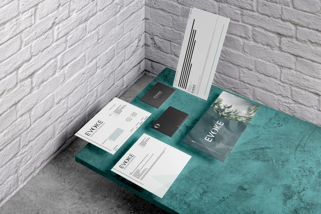
Evoke International.